Showing posts with label Colour. Show all posts

Saturday, March 29, 2008

CAN OF PEAS COLOUR MODEL

Hey guys, I just wanted to address a colour inconsistency I noticed with the pea cans. I noticed that in some of the BGs the pea cans were red and in other they were green. According to Jason's model sheet the can should been green. Which makes sense cause evil stevil's gloves are red. Here's Jason's colour model for the pea cans. Also, for the pea's themselves, use this as the colour model too.


Wednesday, March 26, 2008

COLOUR MODEL UPDATE

*IMPORTANT UPDATE*

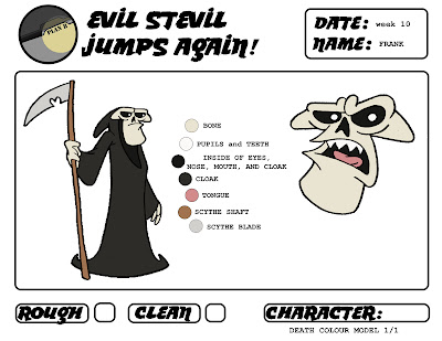
I updated the Death Colour Model...The colour of his bone was too close to Evil Stevil's Jump Suit, So I fixed that. All the correct colour models are now on the server with instructions on how to import the colour palette into flipbook (thanks to kayla). However, if you grabbed the colour model for Death off the blog post before tonight, you have the WRONG colours. I just updated that post with the PROPOR colours. The End.

Friday, March 21, 2008

Death - Colour Model

Here's the colour model for Death...again..sorry for the pixelated quality, no worries, the actual clean up won't look like that if we scan it at a high enough resolution lol. But yeah, just to repeat what jack was saying...the colour models are to be followed through out the entire film. Any change in colour through mood will be achieved with filters during the compositing stage. (refer to earlier post for the ES colour model.) I'll throw all of these files, as well as the flipbook file I coloured them in (with the palette) on the server next week.

Thursday, March 20, 2008

Evil Stevil - Colour Model

So here are the colour model sheets for Evil Stevil. I coloured these in FlipBook...so the palette has been created and saved. I'll drop it in the server next week along with these pages. It'll all be in a new folder called "COLOUR_MODEL". I'll also post the colour model for death either tomorrow or saturday. Let me know what you think so far.
PS. I aplogise for the pixelated line. I didn't scan the drawings at a high enough resolution. For the sake of a colour model it didn't matter, but obviously the real clean up wont look like that.


Thursday, December 6, 2007

Storyboard: Rough to Clean

I cleaned up one of Rory's panels. We should def splice some or all of these clean character panels into the leica. Could be a cool idea.


Thursday, November 8, 2007

Death....IN COLOUR!!!


Death in colour...just for the hell of it

Wednesday, October 24, 2007

Coloured Versions of my Designs of ES


So I found some time to colour a couple of my designs…just to get a better feel for them...I definitely like the body on the first guy way better...I'm on the fence about the peg leg...I love the idea of the peg leg but I’m just wondering if there’s a better way to include the peg leg design-wise...rather than just a stick of wood...maybe like the end of a cane with a rubber stopper...or a piece of metal like shrapnel style...or a crutch like contraption like the one found in Rory's research...I’ll definitely continue to play around with that...the last thing is regarding the goggle's...After getting used to drawing him without them...I think he works better without them...I loved those things...thought it was hilarious that he canned the goggles for huge glasses, but still kept the goggles around...just the redundant nature of that was funny to me…but at the same time…his head was so cluttered with detail when he wore the goggles...but then there's that age old design rule that says there needs to be gaps of space around areas of important detail...so...it’s probably better not to have his head too cluttered...anyways...I'm excited get back to work on the film...start zoning in on some design stuff.

Saturday, October 13, 2007

Poster!


Howdy!


While i was working on this, i wanted to give sepia tone with old tv look to it,


so i added brown and murky yellow color to overlay and used halftone + noise filter on it.


The fonts are the big issue.


I tried the "texas" lookalike font but it looked too busy.


so by looking at these fonts, please vote from 1 - 5 if you have time,
if you dislike all of them and if you carry some nice font that will suit our
film, please post em :D

-Haine

Saturday, October 6, 2007

Haine's color Study


some color studies :)
sorry for the bad quality..

Green: In a flip side, green symbolizes jealousy or envy (green-eyed monster) and inexperience.

Friday, October 5, 2007

Pre-Pitch Stuff


This is for the pre-pitch...figured we should throw in some colour stuff too. I'll be scanning and organizing my pile of post-it sketches...those'll be up later today for you Nabz.